When adding a hyperlink to content or alternative (alt) text to an image, the text must be meaningful. It should explain the purpose and make sense on its own (independent of surrounding content).
Meaningful Hyperlink Text
Those using a screen reader can “skim” a document by having the screen reader announce all of the links. Using meaningful text, such as the title of the webpage or file being linked, will enable users to understand why they would want to click on the link. For example, this hyperlink text matches the title on the destination page: Templates and Themes for Office Online.
Make It Unique
Many times, we have more than one link on a page or in a document. When creating meaningful text for each, try to keep track of the text you use. Since screen readers can announce all of the links, make sure you don’t use the same text for two different URLs. For example, it’s fine to link to the college website using the text, “MCC website,” in multiple places. However, you can’t have one of those “MCC website” links point to the directions. The link text should give the reader/listener an idea of the destination. Similarly, if you have two pages about the same subject but with different content, such as “Tutoring for Students” and “Tutoring for Faculty,” links in the content and navigation can’t all be called “Tutoring.” The link text needs to explain the difference between the links.
To sum up, links to different destinations (web pages, files, or email addresses) need unique link text. Links to the same destinations can use the same link text.
Important Do’s and Don’ts
Consider these when creating hyperlink text:
Link text should not contain phrases like “click here,” “learn more,” or “article.” These are not meaningful. (Why should I click here? Learn more about what? What is the article about?)
Do not add the word “link” as part of the text. A screen reader will inform the user that the text is a link.
Do not use the same link text for different destinations. If you have multiple “Register for Zoom Meeting” links on a page that link to different registration forms, it is confusing and frustrating to the visitor. confusing and frustrating.
Below are some things to keep in mind depending on the type of link.
Link Text
Do:
Warn a reader if the link points to something other than a web page, such as “End of Year 2024 Report (XLS)” or “How to Crochet (Video).”
Link entire sentences. This is too much information.
Use very short links (like a character). Some users with physical difficulties might find clicking a hyperlink so small a challenge
Use a long URL as a hyperlink. Often, this is announced as letters, which will make no sense to the listener.
Graphic Link
Do:
Always have alt text, even if it’s NULL (see below).
For decorative images, such as a banner, a NULL alt tag ( alt=”” ) can be used.
Alt text should be clear and include any text in the image.
Logos should include the name of the company and describe the logo. For example, the main college logo uses the following alt text: MCC shield logo with text: Monroe Community College, State University of New York.
If the image contains a graph or chart, the alt text should summarize the information it is trying to convey.
Don’t:
Use phrases like, “image of …” or “graphic of …”.
Use redundant text (i.e. – the same as adjacent or body text)
Add very small (10px) images that are difficult to click on.
Adding a Hyperlink to Text
Select the meaningful text you would like to use for the hyperlink.
If this is intended for print, include the URL or email address. (You can’t click a link on a piece of paper!)
From the tool ribbon, select Insert, then click on “Link” from the Links section; or right-click on the selected text and click on Link from the pop-up menu.
In the “Edit Hyperlink” task pane, choose the following:
Figure 1
Linking to a web page or file (such as a PDF)
Under “Link to,” select “Existing File or Web Page.” (See Figure 1.)
In the Address field, paste the URL of the web page or file you want to link.
Linking to an email address
Figure 2
Under “Link to,” select “E-mail Address.” (See Figure 2.)
In the E-mail address field, paste or enter the email address.
Click on the “ScreenTip…” button and add the link text without a hyperlink or email address. (This is especially helpful for those accessing the document with assistive technology.)
Click OK to save the ScreenTip, and OK again to save the link.
Reminder: While adding emphasis to text, do not use underlining. This is reserved for hyperlinks. Using it for regular text is confusing to the reader. Instead, use Strong, Emphasis, or Intense Emphasis.
Just as with hyperlinks, we need to provide a meaningful description of images in relation to the context used, whether of a photo or a chart that corresponds to data. Also, it should include any text in the image. This description is entered in the image’s alternative, or alt, text. Without it, a screen reader will only announce the file name.
Alt text will vary based on the context. It should be relevant to the content of the surrounding text or document. WebAIM offers some thoughts about image alt text in Word and CommonLook provides some guidelines to consider. WebAIM also has some great examples of alt text as it relates to the content (i.e. – the purpose of including the image). There is also a great alt text decision tree by W3C. Alternatively, one way to test is if you replace your image with just the alt text. Does the alt text make sense in relation to the surrounding content?
In addition to the relevance of the alt text, we need to be mindful of the number of characters. The recommended length of alt text is no more than 125 to 140 characters, with many screen readers cutting off alt text at 125 characters. For more complex images, consider explaining the content in a caption in addition to the alt text. The alt text would be a brief summary of the main idea from the image. The caption would describe the image in detail.
Note: Don’t include “Photo of” or “Image of” in the alt text. Screen readers will announce the object as an image.
Figure 3
Adding Alternative (Alt) Text to an Image
Right-click on an image and select, “Edit Alt Text …”.
In the Alt Text task pane, enter a description of the image as it relates to the content. (See Figure 3.)
Below are some examples of meaningful image alt text.
Alt Text: MCC shield logo with text: Monroe Community College, State University of New York
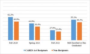
Alt Text: Based on Receipt of CARES Act Funds. Fall 2020 62.2% recipients vs. 49.9% non-recipients. Spring 2021 44.8% recipients vs. 36.4% non. Fall 2021 27% recipients vs. 23.4% non. Still enrolled or has graduated: 55.1% recipients vs. 48.3% non.
Insight Into Images
I know many people love to jazz up content with cool graphics and photos, but are we really helping the reader understand the information we’re trying to convey? Some images can actually confuse or even frustrate the reader, especially if the images are not directly related to the subject. This article, Research insight: accessibility of images, discusses reactions by a group of disabled users that might change what images you add to a document or how many.
Foreground/Background Contrast
While we spend a great deal of time ensuring an equal experience for disabled visitors, we can’t neglect our sighted visitors. When adding images that contain text, we need to be mindful of the contrast between the foreground (the text) and the background (the image behind the text). If the foreground is too light or too similar to the background, it makes the text difficult to read. Tools, such as WebAIM’s Color Contrast Checker and Who Can Use, let you test the contrast levels. This article about ensuring high contrast for text over images offers tips on how to improve your image.